
If you place university diplomas from different countries side by side, the differences are immediately apparent, even without reading the text. Some diplomas feature traditional fonts, official seals, and formal language, while others employ surprisingly minimalist layouts—often displaying little more than the university’s name, the degree earned, and the necessary signatures.
There is no universal international standard for diploma design. Traditions vary by country and, in many cases, even between universities within the same country. Paper size, typography, wording, seals, and even the use of white space can differ significantly.
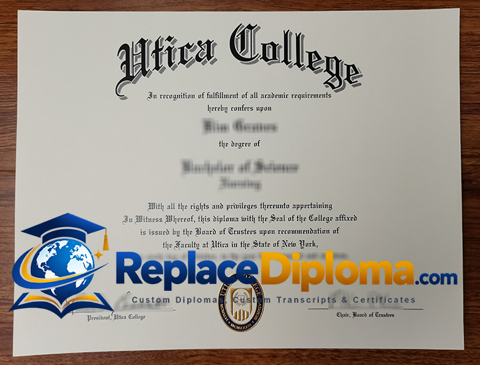
United States diplomas are relatively traditional and formal
United States university diplomas typically feature a distinctively traditional style. The name of the institution is often displayed in a large serif or decorative typeface, while the graduate’s name is prominently positioned in the center.
An official seal is another common feature; depending on the institution, this may be applied via printing, embossing, or gold foil stamping. Signatures from university officials usually appear at the bottom of the document.
Nevertheless, designs vary significantly from one institution to another. Long-established universities may favor classical designs and formal wording, whereas newer institutions might adopt cleaner, more modern layouts.
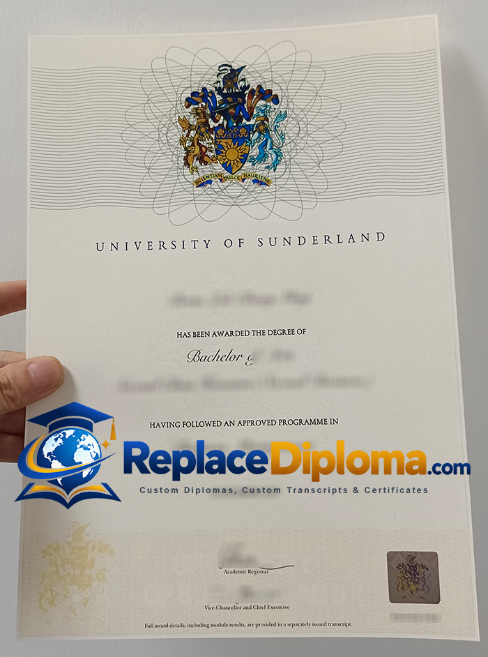
British degree certificates feature minimal ornamentation and an understated style.
There can be significant visual differences between British and American degree certificates.
Many British diplomas favor relatively understated designs. Rather than cluttering the page with decorative elements, they focus on the university logo, the graduate’s name, the qualification details, and the conferral information.
The typography is typically formal but avoids being overly ornate. A university crest or coat of arms may appear at the top, with signatures and administrative details positioned below; additionally, most British degree certificates incorporate a holographic mark.
The final result conveys a sense of formality without relying on elaborate decoration.
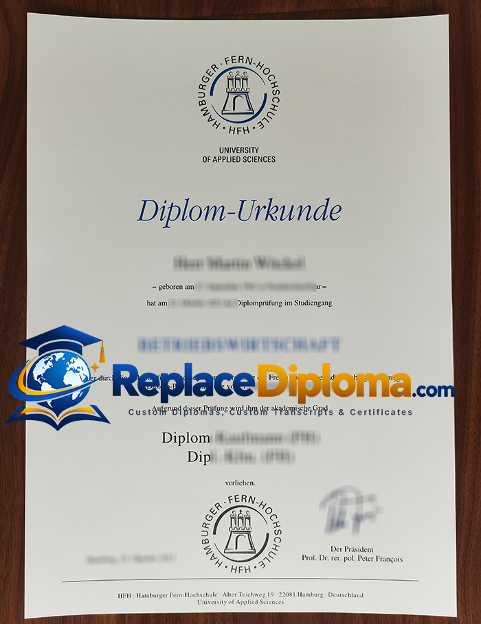
Distinctive Visual Traditions of German Degree Certificates
German university certificates often stand out due to their unique typography and information layout.
The word “Urkunde” (degree certificate) may appear prominently on the document, and the explanatory text is often far more extensive than that found on some English-language certificates. Modern German institutions may opt for minimalist layouts, institutional branding, and carefully considered spacing rather than ornate borders.
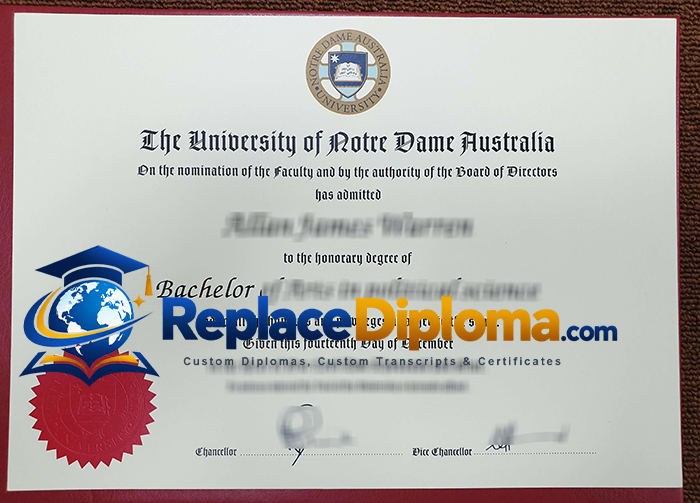
A Blend of Traditional and Modern Styles in Australian Diplomas
Australian degree certificates exhibit significant stylistic diversity.
Some certificates retain a traditional look, featuring the university crest, formal typography, signatures, and embossed seals. Others adopt a more modern branding approach, utilizing ample white space.
The university crest can serve as the most striking visual element on the certificate, particularly when other design features are kept understated. Some certificates also incorporate colored borders and seals, enhancing the distinctiveness of an otherwise simple design.
Canadian Degree Certificates: Clean Layouts and Distinctive Institutional Branding
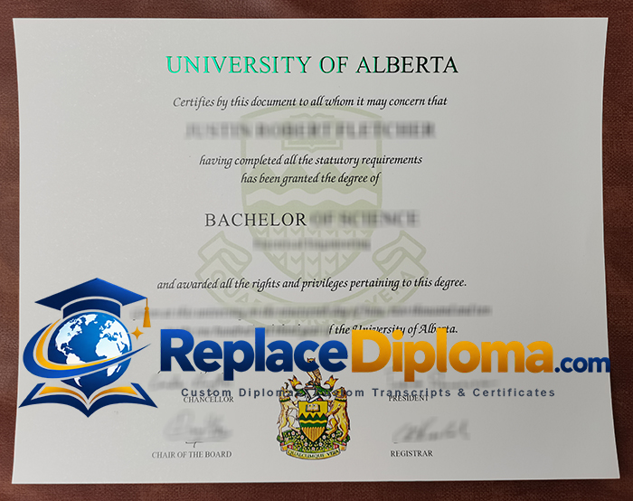
Canadian university diplomas typically combine traditional academic elements with relatively clean, minimalist layouts.
Prominent university names, subtle background crests or watermarks, and carefully designed signatures are common visual features. Some institutions eschew excessive ornamentation, focusing instead on a single emblem or coat of arms as the visual centerpiece.
The amount of information displayed on the certificates can also vary; some emphasize the qualification and field of study, while others include more formal statements regarding the conferral of the degree.
Diplomas from Singapore and Malaysia Reflect Diverse Design Styles
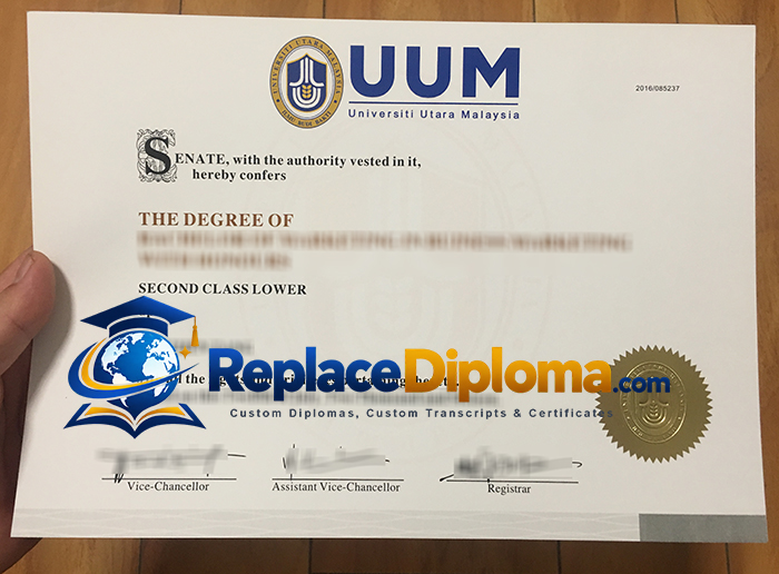
Documents issued by higher education institutions in Singapore and Malaysia—including universities and polytechnics—are particularly noteworthy because they do not adhere to a single visual design paradigm.
Some documents are deeply influenced by British academic traditions, while others adopt modern institutional branding. Depending on the specific institution and the time of issuance, these documents may feature school crests, embossed or gold-foiled seals, signatures, serial numbers, and meticulously typeset qualification details.
Why Focusing on Specific Institutions Matters
While national-level differences offer insight into general design trends, they do not tell the whole story.
Even when two universities are located in the same city, their document layouts can differ significantly. Furthermore, design styles often evolve when a university updates its logo, branding, official name, or document format.
For this reason, rather than assuming that all diplomas from a particular country follow a uniform pattern, it is far more informative to examine specific examples.
At ReplaceDiploma, our sample library features diploma and certificate designs from institutions across various countries, catering to needs ranging from novelty collections and displays to replacement references and keepsakes. By browsing these specific samples, you can clearly observe the distinctions between universities regarding typography, seals, signatures, spacing, and institutional branding.
The true beauty often lies in the finer details. Whether it is a striking embossed seal, bilingual text, or a minimalist layout, these elements vividly reflect the unique design heritage of the issuing institution.